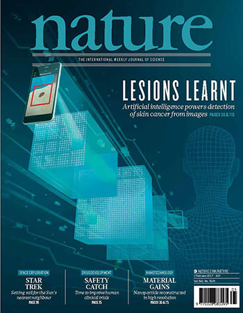
I was asked to create cover art for a paper which ended up being published for the 2/2/2017 Nature Journal issue.
Researchers at Stanford had trained a neural network with images of skin lesions and diagnose those which appeared to be malignant melanoma. They proposed that such software could be packaged as an app, and be a valuable tool for dermatologists.
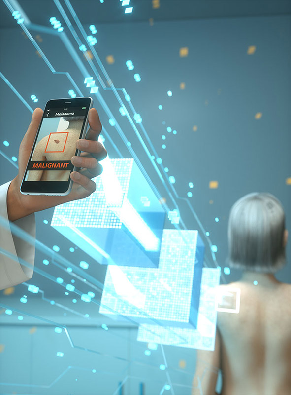
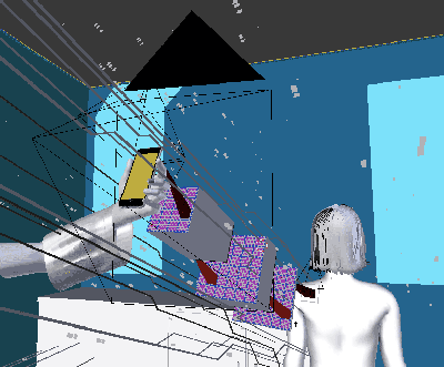
Cover artwork at submission, before Nature's modifications
They thought their paper had a good chance of making the cover and wanted to submit it along with cover art.
Story and Tone
In our initial meeting we discussed the story and tone conveyed by the artwork. The image needed to convey that software running on a phone, using a neural network, could diagnose a malignant skin lesion.
Some kind of diagram for a convoluted neural network (CNN) seemed necessary. I pitched the idea of an exploded schematic view of a phone. The diagram for the CNN could replace the electronics, and stand as a visual metaphor for the process within the device.
I had prepared examples of prior machine learning covers, and browsed the past couple years of cover art. We didn't want to submit something that was a complete mismatch in style.
The Nature Journal covers I looked at fell into a few rough buckets:
Directly illustrate the paper's subject
Display elements of the paper's subject in a graphical setting
Display an artifact of or photo from the research
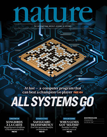
I loved the artwork for "All Systems Go" however and thought that it'd be appropriate for a following machine learning cover to utilize the circuit board motif.
This gave me enough structure to start composing some concepts.
Structural Concepts
Taking our drawings and notes I compiled a few things and returned with the following three rough concept sketches, one of which I colored:
Concept 1Concept 2Concept 3
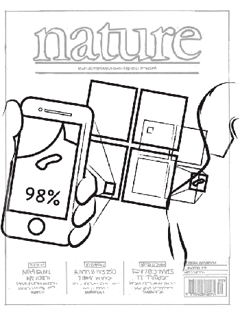
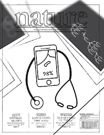
The first concept used a linear storytelling approach. The doctor held a phone with a diagnosis. Between the phone and the patient, a CNN snaked out to the initial image captured on a seated patient. The path of a single kernel was highlighted throughout the layers. This was the most literal and minimal approach I could think of.
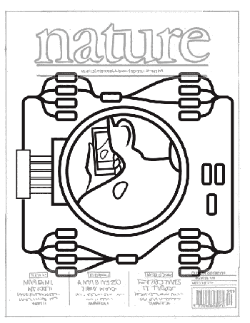
The second concept was a bit more mysterious and took a recursive approach. The patient sat looking at the results on the app. Their lesion is visible to us, through the lens of a board-mounted camera mounted on the final layer. The final layer contained a CNN diagram using the traces and components mounted on the board. This could be rendered in rich gradients, gold and copper vignetted with glowing LEDs twinkling in the edges. I thought this concept was worth enough to do a quick colored version.
The final concept I threw in to see if we had interest in looking at the results of the paper being remarkable enough in itself or from a medical viewpoint. This could serve as a fake artifact of the research. This concept focused more on the dermatologist and app interface. In retrospect, a dermatologist probably wouldn't use a stethoscope so that might need to be swapped. X-Ray images on the table could show a CNN diagrams hinting at the contents of the paper.
Our direction
The third concept was quickly tossed out. The authors wanted to have the article's subject visually displayed. The second concept was considered but there were some questions.
We agreed to pursue concept 1, and talked about choosing an art style.
We were all interested in a surreal, hi-tech, clinical look. The art would contain magical CNN illustration, glowing between doctor and patient.
Concept 2 (Color)3D Scene for the render
Creating the Image
Using Blender, I modeled each sketch component and placed them in a sparse, but clean, well-lit doctors office. I then rendered the scene in Octane Renderer.
It was fine, but just looked pretty boring, so I added sparks and "magic-complexity-lines" running along the CNN. It looked like sci-fi space fiction. We decided the person photographing the lesion should be a doctor so I added a lab coat sleeve. In the final draft, I increased the kernel stride indicators
Draft 1Draft 2Draft 3
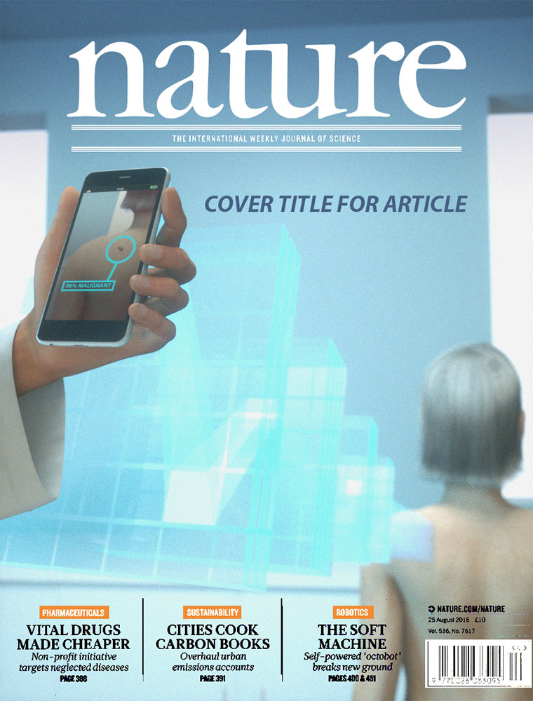
I increased the contrast, made the diagnosis on the screen more intense. Time was running out! We submitted the final version and I went off on vacation.
Modifications, and Final Version
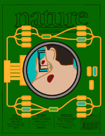
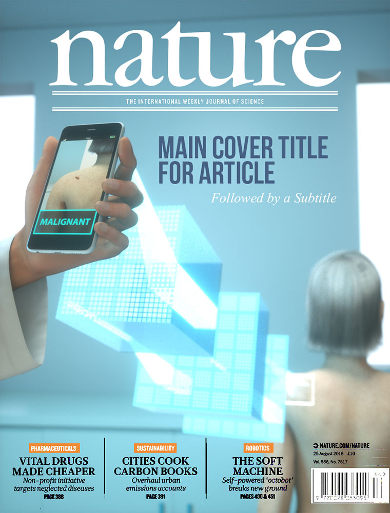
While on vacation, I got news that Nature wanted to use the image, but requested a few changes. I was backpacking far from anything which I could use for rendering. Fortunately, my colleague Uri Tsarnotszky was around to receive the source files, and re-render the changes.
The hand holding the phone was removed and the point of view changed. Depth of field was removed and contrast was increased again.
Here's the final cover image: